Successful case managers make quick calls on high-level information and dive into details for more complex decisions. As case sizes explode and technology evolves to keep up, more case managers are learning that data visualization and other reporting tools throughout the case lifecycle can help them gather the right insight at both levels.
After discussing data insight with case teams in four cities during the recent Relativity Spring Launch Roadshow, there seems to be five areas that excite them most about what’s possible today.
1. You can make better decisions on what to collect (and what not to).
 Today, your custodians consume (and produce) information simultaneously across devices, networks, and locations. This can be a collection nightmare for corporations striving to remain diligent in their e-discovery practices, while avoiding overly inclusive collections that place a major strain on time and budget restrictions.
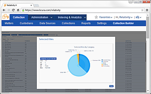
Get a better grasp of what’s on a custodian’s machine by taking advantage of ways to break down the information there, such as the folder structure, file names, and metadata information like file type and size. This enables you to take more informed, defensible actions on what needs to be collected and what can be defensibly considered junk.
2. You can remove irrelevant files prior to processing.
 Business users sent and received an average of 121 emails a day in 2014. This is expected to grow to 140 emails a day by 2018, according to the Radicati Group. And, nearly 12 percent of the emails were spam not caught by filters and delivered to a user’s inbox. Processing these files means reviewing unnecessary information, placing additional time and cost burdens on your project.
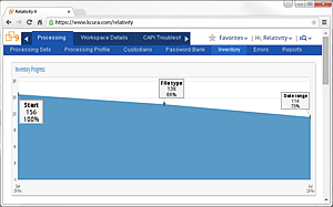
Before you even begin review, take a step back to filter out obvious spam email domains—and maybe a few other parameters, such as date ranges. As you’re performing this analysis, pay attention to how much these choices decrease the size of the data being pushed to your review project. That becomes your picture of the valuable resources you’re saving downstream and a snapshot of the defensible decisions you made.
3. You can verify a collection with a quick look at the data’s timeline.
 Data visualization is the quickest way to identify the effectiveness of your collection as well as any gaps in your analysis of the data at hand. You can avoid a Lois Lerner-style mishap of missing emails simply by viewing the sent dates of an important custodian’s emails to verify there isn’t a gap in the collection. Those gaps, however, are hard to identify if you’re scrolling through a list of records. Once that data is presented as a graph, the picture becomes much clearer.
You can also take advantage of charts and graphs to see how issues trend over time, check the prevalence of search terms in your data set, and dive deeper into reviewer coding decisions. It’s as simple as identifying what should be on the X-axis and what should be on the Y-axis.
4. You can identify discrepancies in coding decisions.
 With larger data sets and tight deadlines, more case teams are using text analytics to improve review speed. With integrated visualization and interactive capabilities, there are even more ways to get answers to key questions throughout the lifecycle of a case.
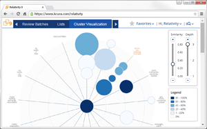
For a quality control check, start with a map of your documents grouped by the concepts they share in common, then layer in coding information for an idea of which concepts have the highest prevalence of responsive documents. Focus on specific document clusters you know are important to your case and view those that fall nearby to spot any similar groups that may not have been identified as responsive.
5. You can ensure compliance with review protocol and verify user actions.
 For large cases, it’s not uncommon to have hundreds of reviewers making coding decisions and taking a multitude of actions in your workspace every day. Monitoring review progress for these massive projects can be tricky.
Improve your workflows by painting pictures of user actions through visualizations of audit data. A quick look at trends in this data will reveal information you can use to verify decisions and ensure defensibility. For example, start with a dashboard that displays documents updated by a mass action or with propagation. Then, dig deeper by layering on additional information like time period, specific users, and coding information to help teams become more consistent in their review approach.

Recommended for you