Since Aero UI began rolling out last month, RelativityOne users around the world have leveraged the updated platform to simplify and improve their workflows. With Aero, our goal is to streamline the way you conduct your e-discovery, investigations, and compliance projects by simplifying the user experience, while still making advanced functionality available to those who need it.
Of course, a huge piece of delivering this simply powerful platform is maximizing the way you visually engage with the data you’re presented with in Relativity. This engagement goes deeper than tab placement or minimizing clicks.
With this in mind, color was at the forefront when we set out to design Aero. Color goes beyond aesthetic value—in fact, it can make or break the usefulness of our software to many of the people who are in it every day.
Put simply, data visualization and reporting is an increasingly critical component of Relativity and all its functions, from widgets and dashboards, to clustering, to active learning. However, our previous color palette was not optimized for color blindness—making it difficult for those features to deliver on their full value to many of our users.
So, at the Aero drawing board, we conducted extensive research to help us optimize a new color palette and address two important aspects of color accessibility: maximizing separation between colors, and maximizing color contrast for legibility.
We’re excited to better serve more of our community with these improvements, so we thought we’d walk you through how we landed on the new color palette you’ll discover in Aero.
Back to Basics: The Science of Color and How We Perceive It
The Visible Spectrum of Color
Let’s start with a quick refresher on a lesson you’ll remember from school.
Put simply, color is the way our eyes and brains perceive light. Visible light is energy that vibrates at a frequency we are able to see. This visible spectrum is what we know as color, and includes a range from blue (high frequency) to red (low frequency). White light is a combination of different frequencies bundled together, which is why it appears to be colorless.
We see color because objects around us absorb and reflect light in different ways. When an object is white, it reflects back white light so we see white; when it is black, it does not reflect any light at all so we see black; and any surface that has a color will absorb all color frequencies except for the color we see. This is how objects “emit” color.
How Our Eyes Work
The result of all this bouncing and reflecting is that our eyes pick up on different frequencies of light in a way our brains interpret as color.
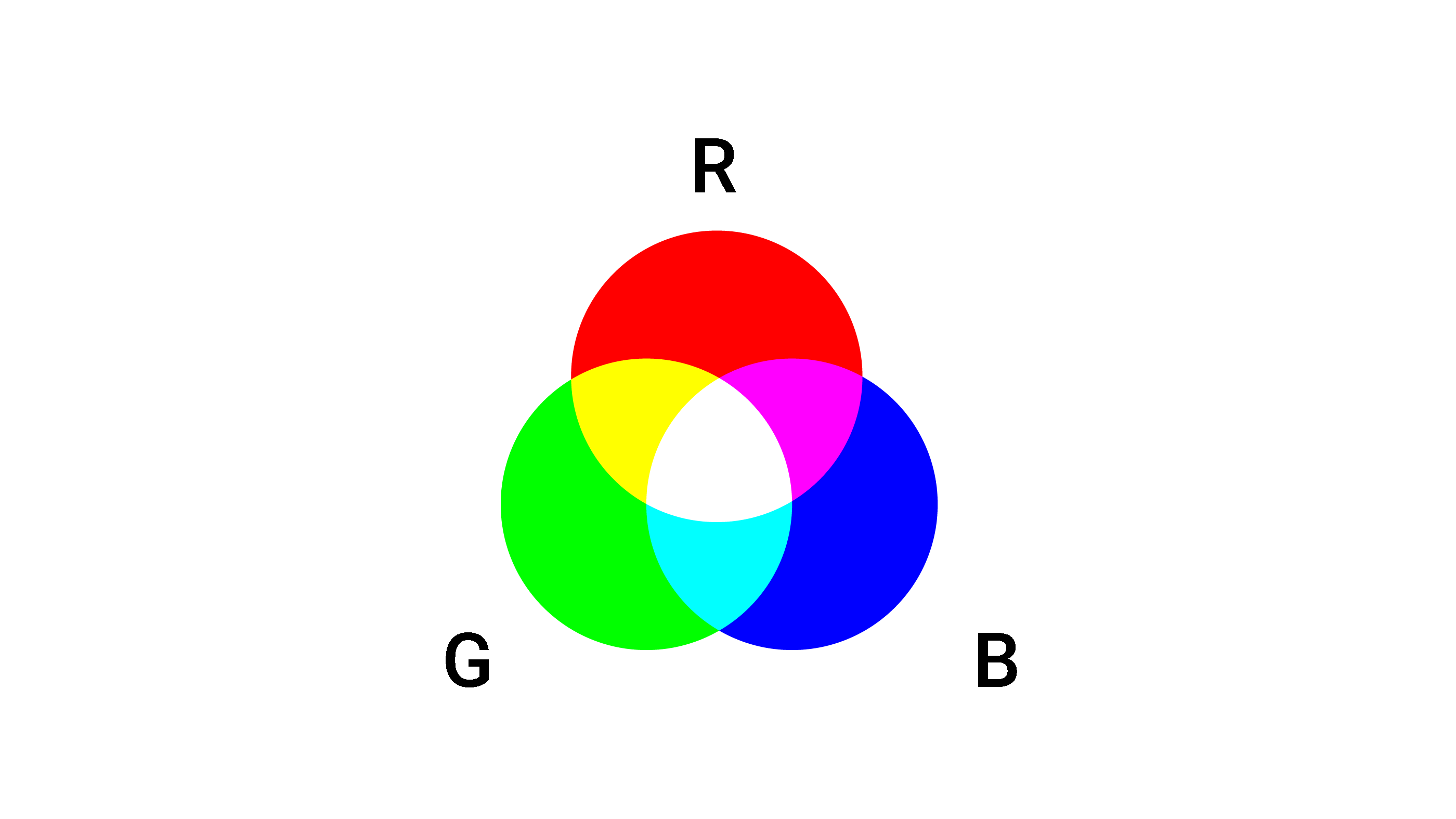
When light hits the back of the eye—the retina—light receptors called cones pick up frequencies in the red, green, and blue spectrum. When these receptors become activated, they signal to our brain that we are seeing a color.
When different cones become activated to different degrees, you see mixes of these colors. These mixes produce all colors. This is known as the RGB color space, which is used in computers, TV, and other kinds of light-based displays.

Conditions of Color Blindness
Color blindness is caused by deficiencies in these cones, and results in difficulty for the sufferer to readily perceive all colors on the spectrum.
There are three main types of color blindness or color deficiencies, each relating directly to an absence or defect of one of the three types of cones: R, G, or B. These conditions are classified, in their most basic terms, as follows:
- A deficiency in red (R) cones is known as protanopia
- A deficiency in green (G) cones is known as deuteranopia (the most common type)
- A deficiency in blue (B) cones is known as tritanopia (the rarest type)
(Find a wealth of additional information on these distinctions—and their complicating factors—here.)

With absent or defective cones, individuals with these conditions are not able to perceive the affected frequencies fully, and therefore see color to a limited degree. So for example, knowing that green and blue together produce cyan: in the total absence of green, you would instead see only blue.

Color blindness is rare in women, but some forms of it can be quite common in men:
- Deuteranopia (green deficiency) affects about <0.3 percent of women and 5 percent of men (that's 1 in 20 men)
- Protanopia (red deficiency) affects about <0.3 percent of women and 2.5 percent of men
- Tritanopia (blue deficiency) affects about <0.1% of women and 0.5 percent of men
When color blindness is not taken into account in software design, it can render applications indecipherable and unusable for people living with these conditions.
Though the American with Disabilities Act (ADA) of 1990 regulates that many businesses, as well as state and local governments, meet standards designed to provide protections for people with disabilities, it does not cover color blindness.
That being said, the ADA and other regulatory bodies refer to the Web Content Accessibility Guidelines (WCAG). These guidelines more generally outline color accessibility in terms of color contrast.
Color Separation and Contrast in Design
A full color space contains more colors than just those in a color wheel, as you can also have variations toward white and black. This would result in a sort of three-dimensional map, where each color can be located and their separation measured. This measurement can be used to “score” a palette in each of the regular and color-deficient spectrums. Then, designers can use a baseline score to improve a palette by maximizing the average distances between colors.
When we set out to reengineer Relativity’s UI many months ago, we began with the knowledge that, for Relativity’s then-current UI—known as Fluid UI (FUI)—our palette scored very highly on a color wheel for normal vision, but not as highly for color blindness conditions.

So, for Aero’s palette, we turned to the experts for help understanding how to best optimize colors. We looked to Bang Wong, the creative director of MIT and Harvard’s Broad Institute (a biomedical and genomic institute). Wong has a master’s degree in immunology and a master’s in medical and biological illustration, is a frequent speaker and lecturer on data visualization, and has published dozens of research papers on color vision.

Wong’s palette recommendation is for eight colors (or seven, if we exclude black). This is consistent with other guidelines and makes good sense, considering that the more colors you have, the harder it is to create separation between them. His palette also trades off its score in normal vision in order to improve scores for the color blindness conditions.
Another critical factor for accessibility is color contrast, which helps with legibility of text.
Black text on a white background is very high contrast, but for black text over color to achieve high contrast, the color needs to be lightened. Specifically, the WCAG guidelines recommend a 5:1 color contrast for both small and large text.
The Aero Color Palette

Aero’s palette takes into account these optimization considerations and carefully balances them to create a palette that meets a new standard.
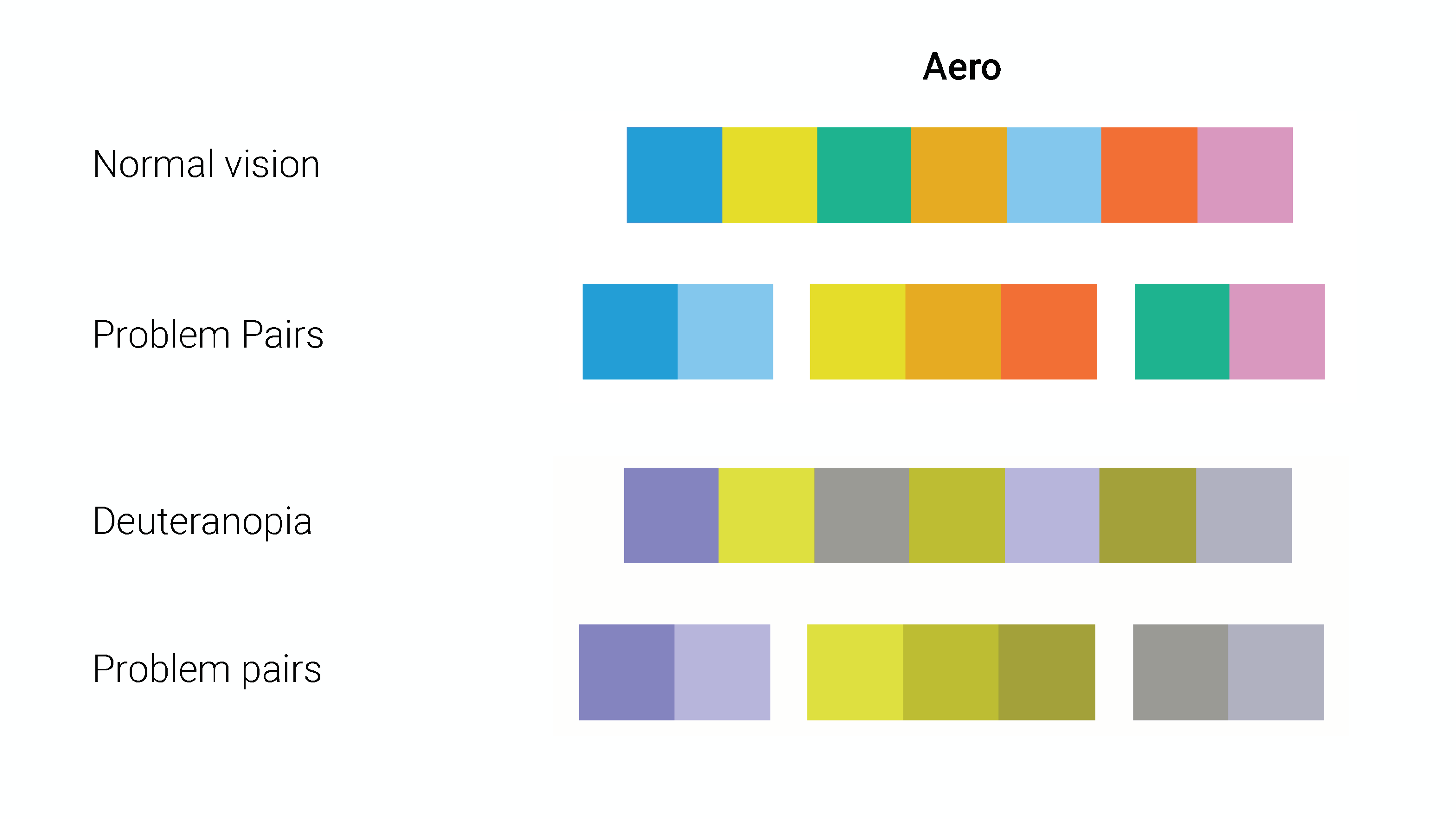
Our new palette is only seven colors so that the design is able to create maximum separation. Colors are also optimized to be maximally separated for all three types of color blindness: protanopia, deuteranopia, and tritanopia.
All of our colors are WCAG-compliant for small and large text when using black foreground text.
These colors are also ordered with high contrast pairs in mind. This means that, as an example, for visualizations that only have two colors, our first and second colors have the highest separation and contrast combination—making them more easily distinguishable even at a glance.

We’re pleased to offer an optimized experience for all of our users in RelativityOne. Have you noticed the difference? If so, please let us know what you think.