As you might expect, one of the most important qualities of a simply powerful platform is intuitive navigation. With Aero UI coming this month in RelativityOne, we want to give you a peek at what the new navigation will look like.
We’re excited to roll out changes to tab navigation with Aero, aimed at making it easier to know where you need to go next. Historically, we’ve heard from customers that tab navigation can be one of the more confusing features in RelativityOne: It’s easy to lose control of your tab structures with too many primary menus, leaving a lot of our customers feeling like they’ve created a monster with their tabs.
You can say goodbye to your navigation monsters in Aero. We redesigned our entire navigation structure so that you can customize navigation to suit the workflows your team actually follow. This means that you’ll be able to empower everyone—from the novice Relativity user to the Relativity Masters on your team—to confidently navigate throughout RelativityOne.
What’s Changing
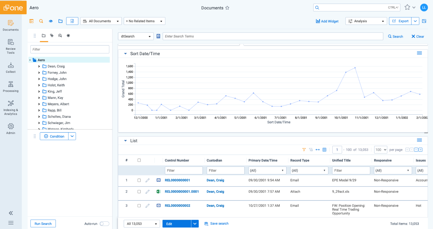
Sidebar with Icons
One of the biggest changes you’ll notice with our new tab navigation is that we’ve moved tabs from the top of your screen to the sidebar. We did this to give more room for the sidebar to breathe, but the change also comes with some key new features.
First of all, we’ve increased discoverability for the tabs that your team uses most. That means that you can customize the sidebar to highlight your most frequently used tabs.
Second, we added icons to compliment the tabs. Having icons to represent the different places you go most frequently in Relativity will make it easier to remember tab placement and scan for the correct tab. All of this is coming together makes a more intuitive, easy-to-navigate sidebar so that you can get where you need to go faster.
Three-Level Tab Structure
Click into any given tab on the side bar and you’ll drill down into our brand new three-level tab structure. We built the three-level tab structure to clean up the sidebar and to make navigating the platform even easier. Now, tabs that used to be individual will live together in larger groups of tabs that fit under one umbrella, thus minimizing the number of tabs you see on the screen at one time.
If you’re working in document review, for example, you won’t have to see all the tabs related to processing and vice versa. These are completely customizable to whatever your team needs, so you can leverage the three-level tab structure to start building out workflow-based navigation.

All Tabs Menu
Should you need the powerful functionality of having all the tabs at your fingertips, you have access to the All Tabs menu. Users that don’t need certain tabs don’t need to see them, but you still have any tab you’d need available at the click of a button.
The root of what we’re building with Aero is a simply powerful platform—and the All Tabs menu is one simple way to access RelativityOne’s most robust features without interrupting the smooth, clean experience users have come to expect.

Tab Sync
We’re also rolling out a new feature specifically built for admins: Tab Sync.
This feature will allow you to use an existing workspace as a source tab template to apply to one or many other workspaces at the same time. This means that you can set up consistent navigation across projects with the click of a button.
If you have navigation that really works for a particular type of matter, you don’t have to build it from scratch every time. With tab sync, you can deliver a consistent navigation experience for your users as they jump from workspace to workspace.

How to Optimize Your Tab Navigation Experience
So, once you’ve upgraded to Aero, one of the first things you’ll notice is that all your current top-level tabs will be moved to the sidebar. Now is a really good time to start thinking about your team’s navigation workflows. Are they working for you? Do you need a change? The navigation paradigm is becoming completely customizable, so we highly encourage you to start playing around and creating new templates of your own once you start working in Aero.
We’ll deliver a default workflow that’s designed to get you started, but this grouping is just intended to kickstart your journey into tab navigation. You will likely need to redesign your existing workspace templates to take advantage of the benefits of Aero tab navigation to best serve your users.
If you’re starting to sweat thinking about this, we’ve got your back. We’ve laid out some tab navigation best practices to help you get started.
Some things to consider as you get started are:
- How many tabs do you want your users to see?
- What workflows do your different workspaces use most often?
- Are there some tabs that are frequently used and others that aren’t?
- What tabs need to live at the highest level of the org structure, and which can drop to the third level?
- Which icons represent the tabs best?
We’re excited to deliver tab navigation to you as part of your Aero upgrade in the coming weeks. Tab navigation is one of the key features we’re delivering in Aero that gets to the root of simply powerful design. It is simple for the users who need it, and powerful for the admins who want to customize it. Before you know it, tab navigation is going to transform the way you use RelativityOne.